- Forum
- Our Servers
-
Leaderboards
-
DarkRP
- DarkRP Gangs
- DarkRP Money Printed
- DarkRP Suit RIPs
- DarkRP Mayor Survival
- DarkRP Nuclear Launches
- DarkRP Bank Vault Raids
- DarkRP Bartender Tips
- DarkRP Air Drops
- DarkRP Casino Vault Raids
- DarkRP Drug Runs
- DarkRP Arena Events
- Police Armory Raids
- Bartender Customers Served
- Police RIPs
- DarkRP GENCoin Sold
- Surf Records
- BHOP Records
- Trouble in Terrorist Town
- Deathrun
- Prop Hunt
-
DarkRP
- Community
- Help
- Store
|
Login to ZARP
|
TOPIC: [SSRP SUGGESTION] Bank UI Changes
[SSRP SUGGESTION] Bank UI Changes 7 years 3 weeks ago #1137508
|
Server Name:
SSRP Suggestion Title: Bank UI Changes How would it benefit the server:
Potential Issues/Exploits:
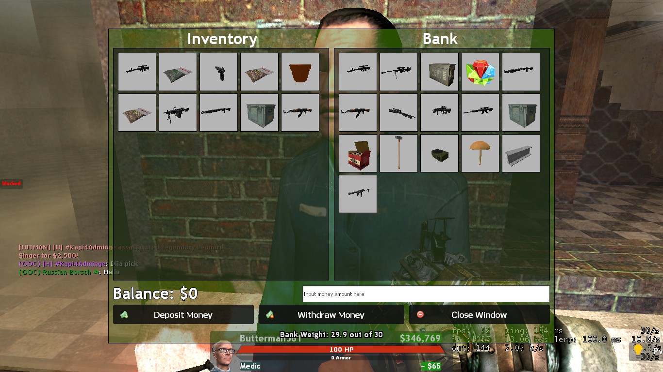
Additional notes: Deposit and withdraw now have four new buttons each. "Clear", "1/2", "2X" and "All" respectively.
"Upgrade Your Account" is now a lot more concise. Removed option to deposit because you only need to have the required amount of money to upgrade in your bank. Moved the description into a small Information icon to save space. Removed an unnecessary display of your balance - virtually useless because your balance is already displayed elsewhere. That's pretty much it. No more major changes. If you have any feedback on what I should add or change, feel free to leave that in a reply. If you think I should drop the old UI theme and create a completely new UI, please tell me that too. Draft: 
[1] The "Upgrade Your Account" section takes a lot less unnecessary space. I would have made more changes to make it even more concise, but I chose to retain certain features & design choices from the old UI. (?) Why the hell am I able to downgrade my account |
|

Ex. Community Council Member Ex. SSRP Super Administrator Ex. Discord Administrator Ex. TeamSpeak Staff Ex. Forum Staff Rick Townsend
Edited 7 years 3 weeks ago by Rick Townsend.
The topic has been locked.
|


[SSRP SUGGESTION] Bank UI Changes 7 years 3 weeks ago #1137526
 This one is better |
|
|
Warning: Spoiler! [ Click to expand ][ Click to hide ]
The topic has been locked.
The following users said Thank You: User1502, Rick Townsend
|


[SSRP SUGGESTION] Bank UI Changes 6 years 8 months ago #1173753
 This would be a pointless addition to the server, It would cause to much confusion and would not be used that often. |
|
|
SSRP- Super Administrator
The topic has been locked.
The following users said Thank You: schnitzel nazi, Micky
|

Time to create page: 0.119 seconds
199 PLAYERS ONLINE
12/127
Online
0/40
Online
0/47
Online
0/32
Online
3/32
Online
0/42
Online
0/42
Online
 Discord
184/1023
Online